
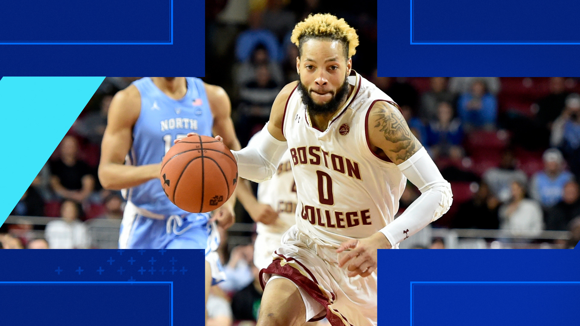
REBRAND FOR THE NEW ENGLAND SPORTS
NETWORK’S COLLEGE-FOCUSED CHANNEL
THE CHALLENGE
—
Following MOCEAN’s successful rebrand of their parent network, NESN returned for a rebrand of NESN+. Drafting off the parent brand, NESN+ needed to reflect the spirit of the younger skewing audience for the college sports aired on NESN+.
OUR APPROACH
—
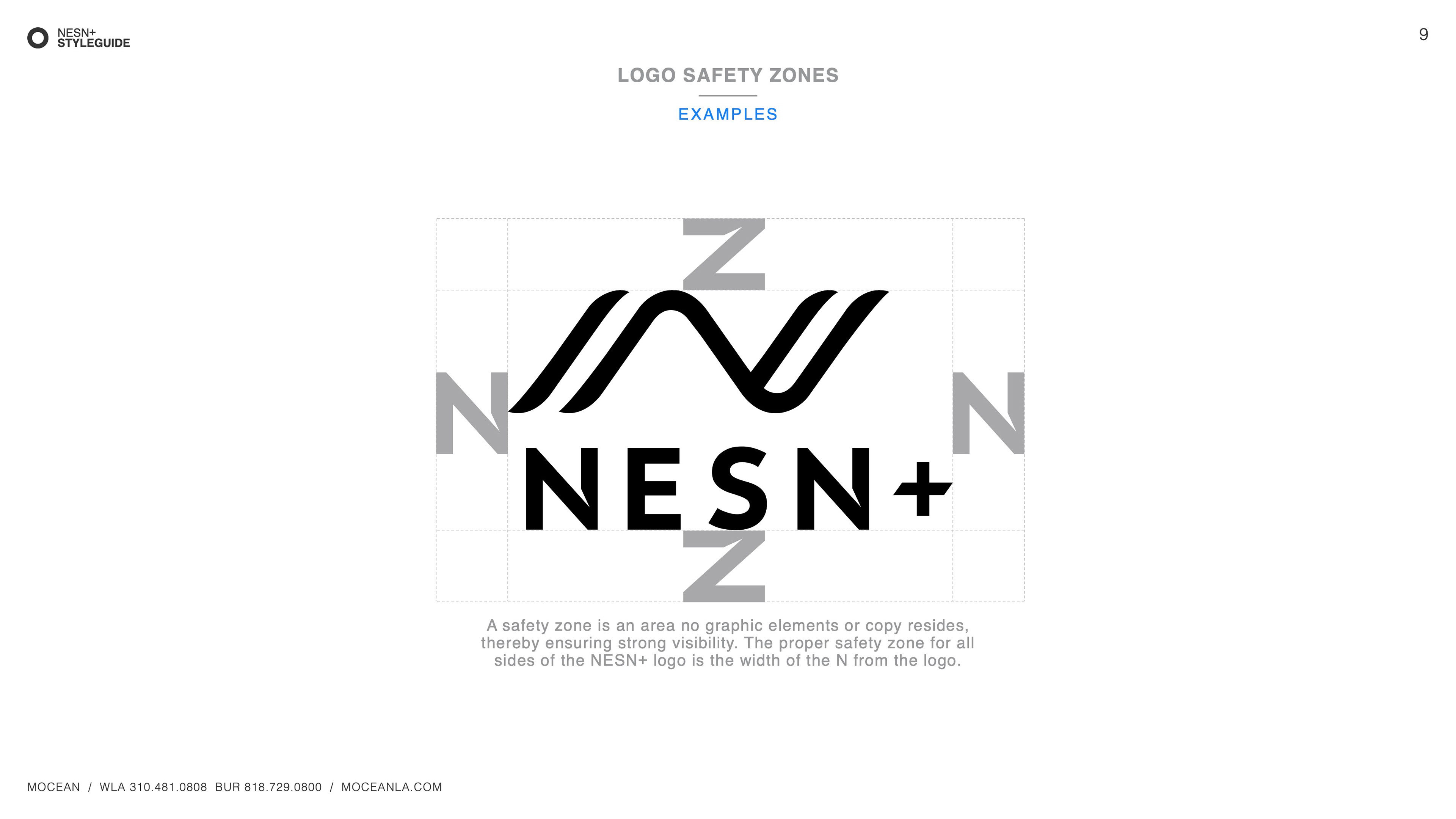
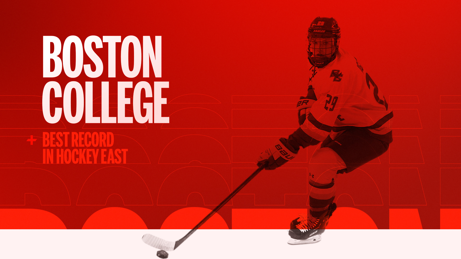
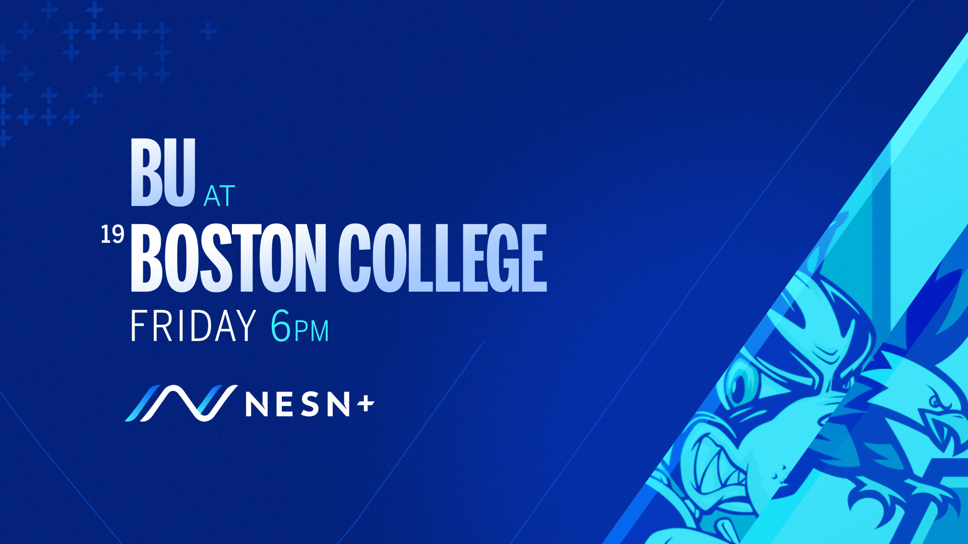
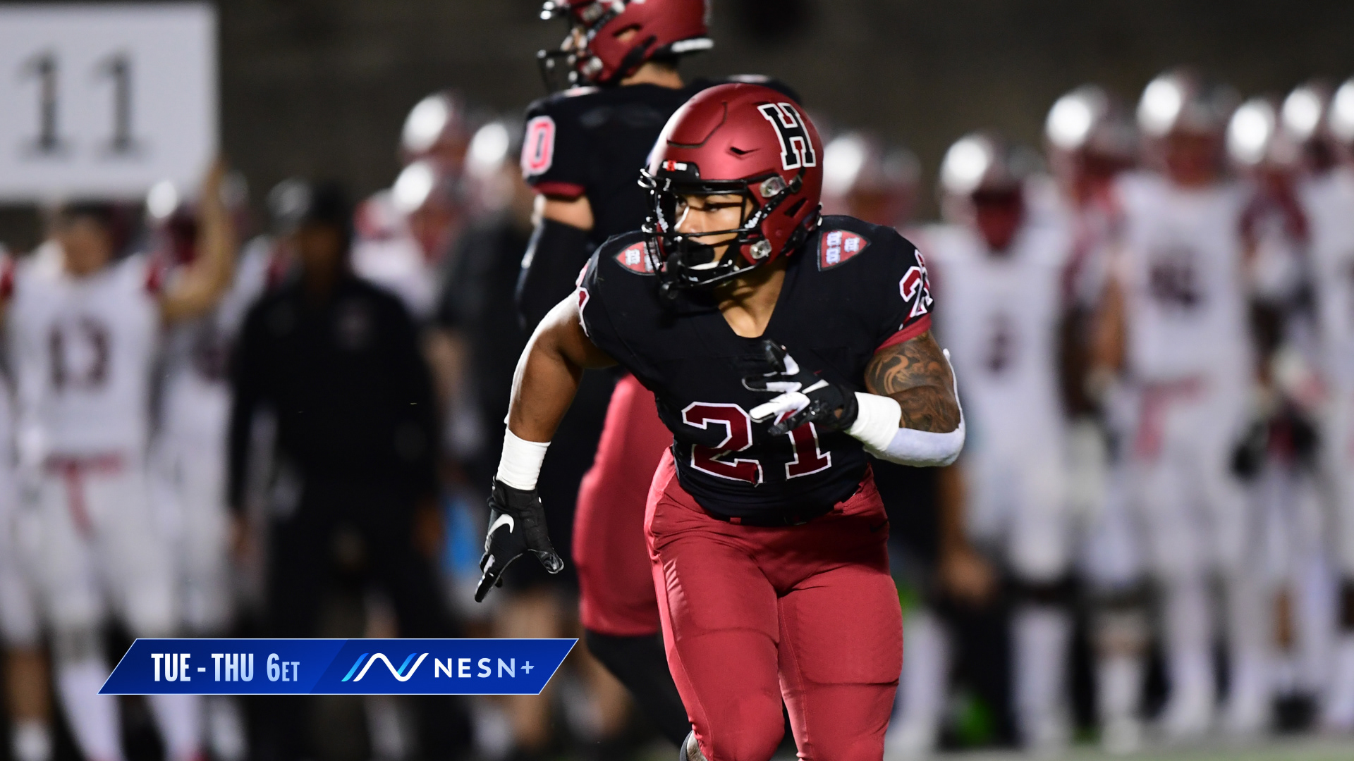
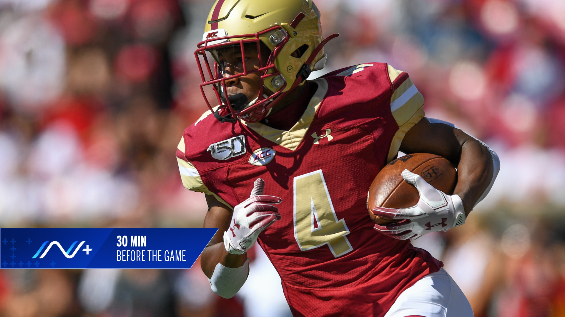
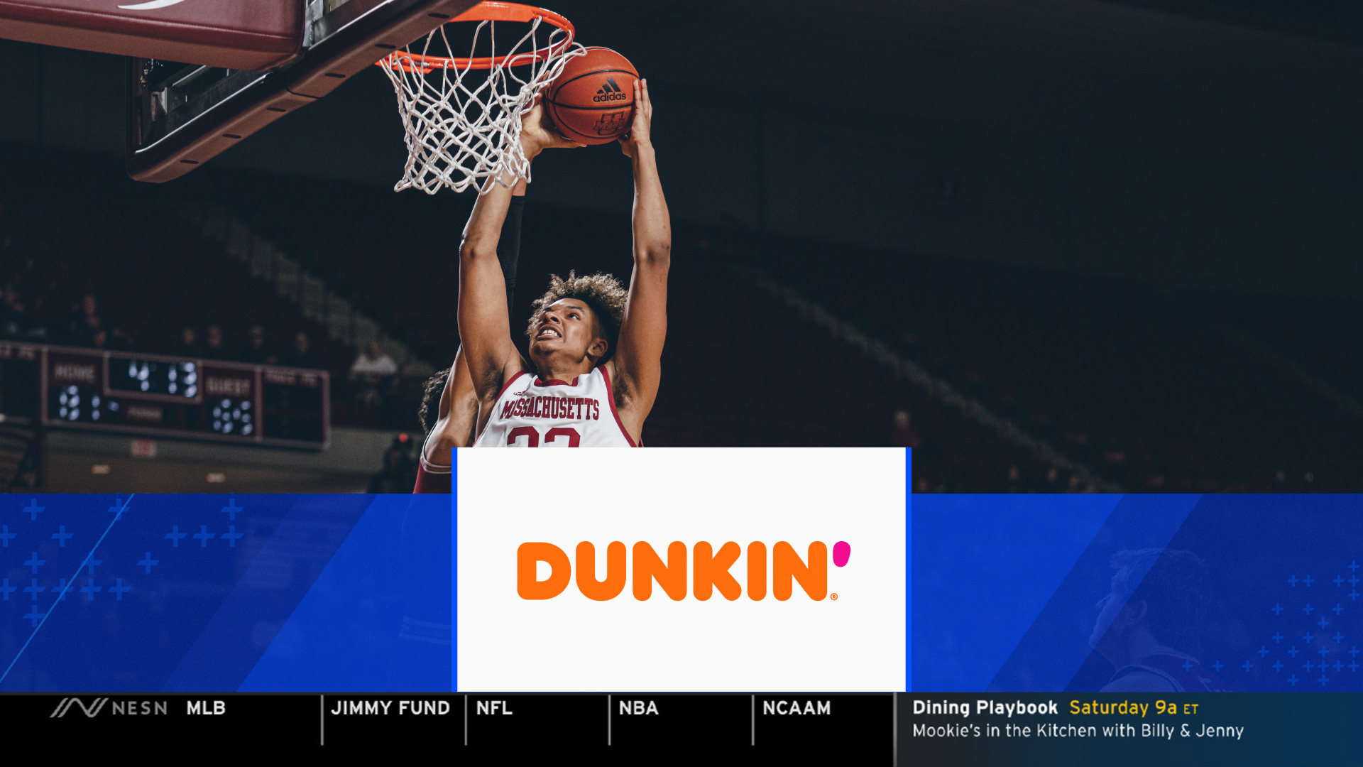
To keep NESN+ in the same brand family as NESN, much of the design language echoed the master brand. Thin outline elements, the NESN mark, and aggressive motion theory all carried over into NESN+. A contemporary type sensibility, vibrant palette, flat color approach and a graphics system designed around the + help distinguish the new brand from the master network.
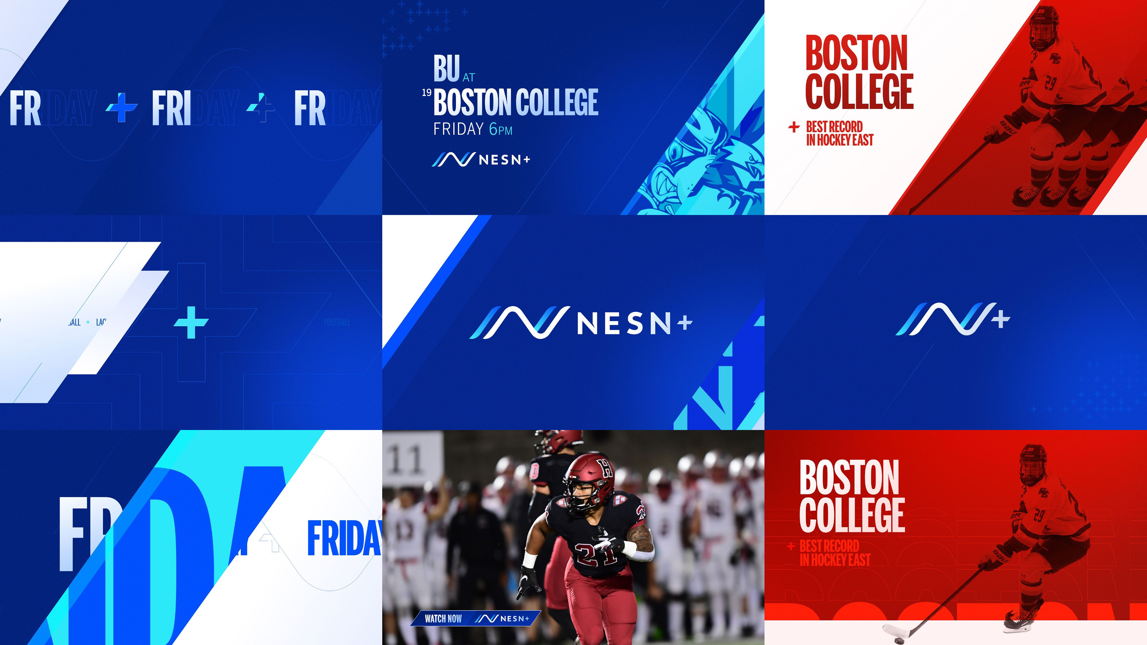
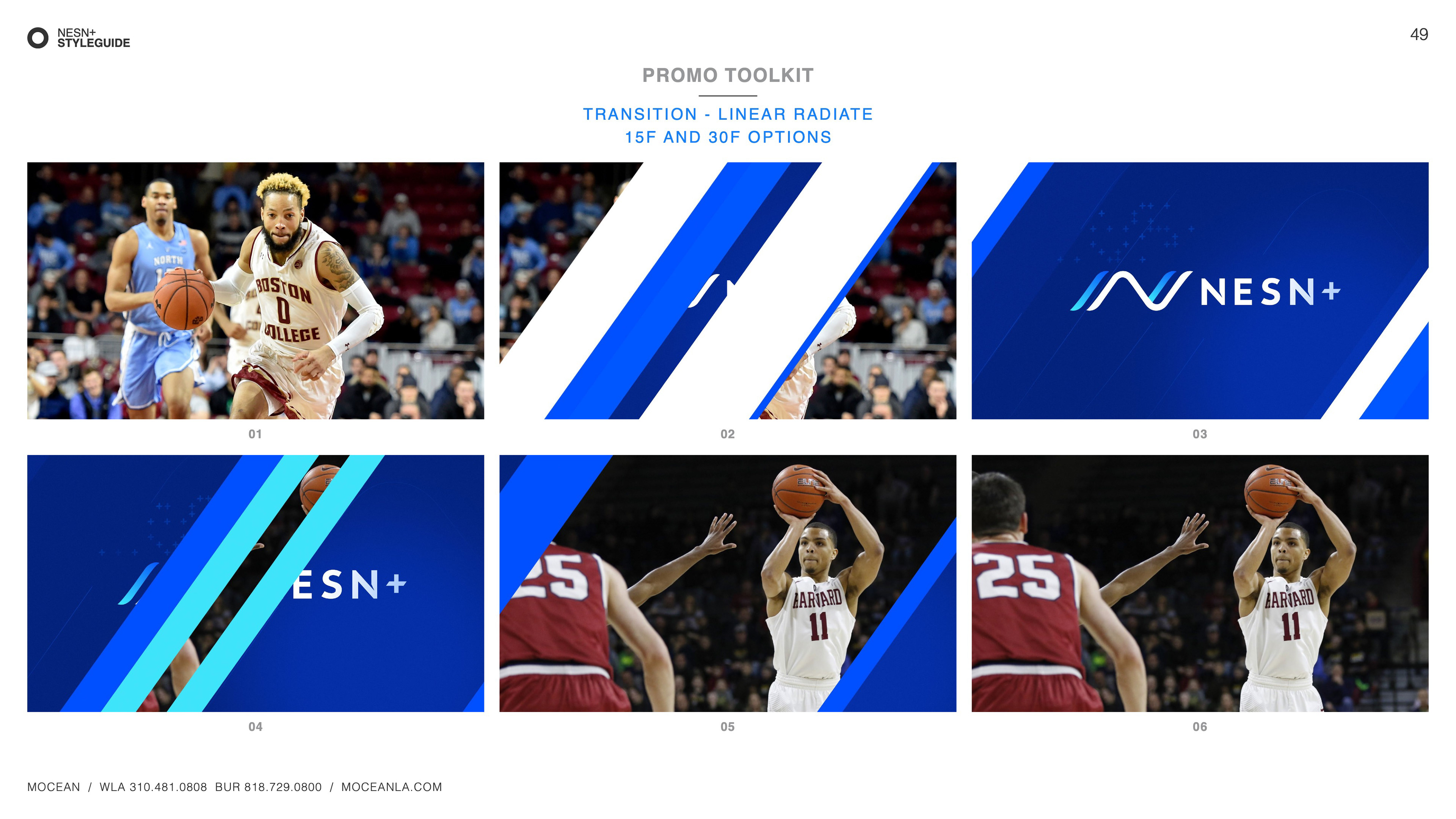
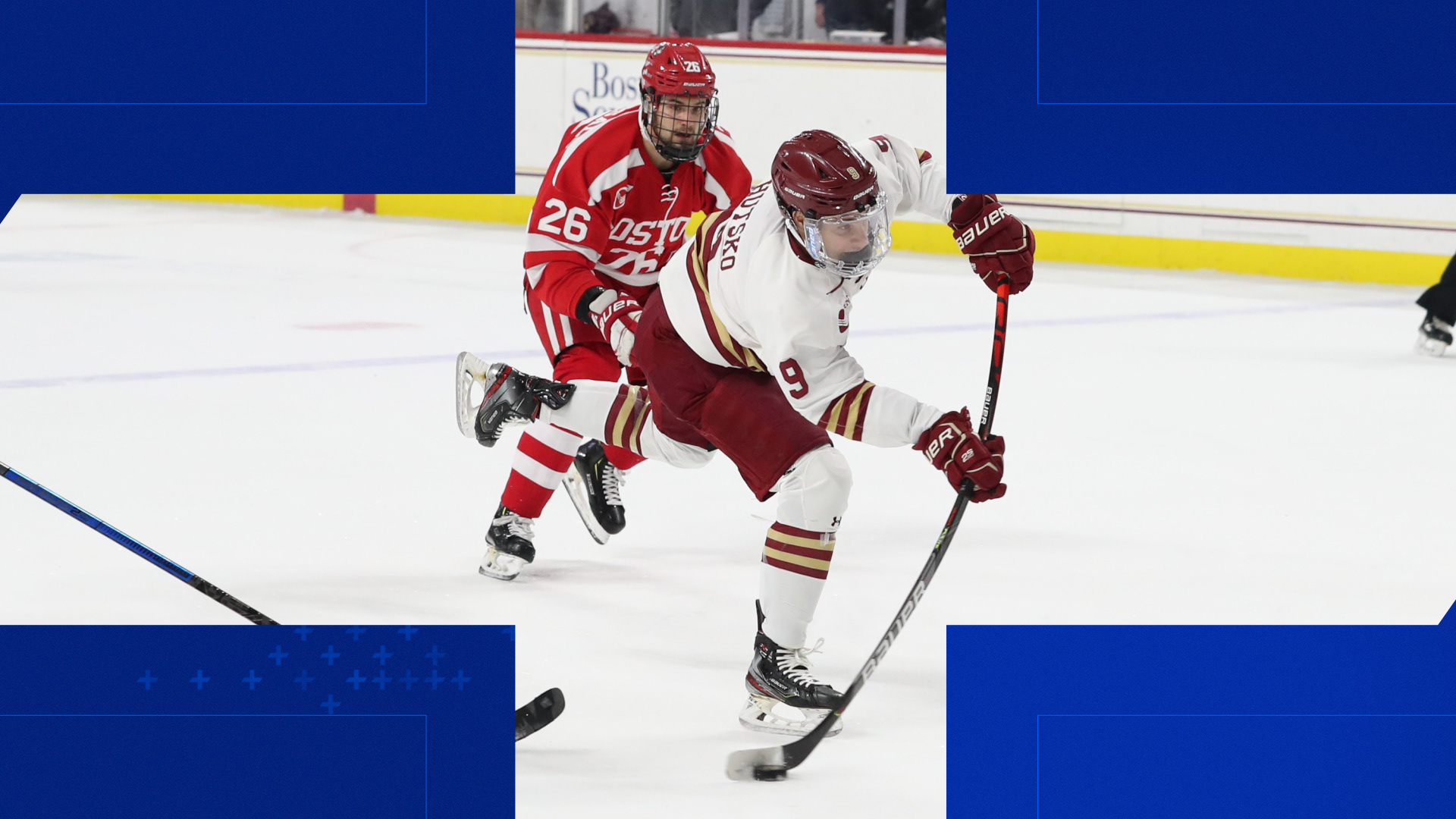
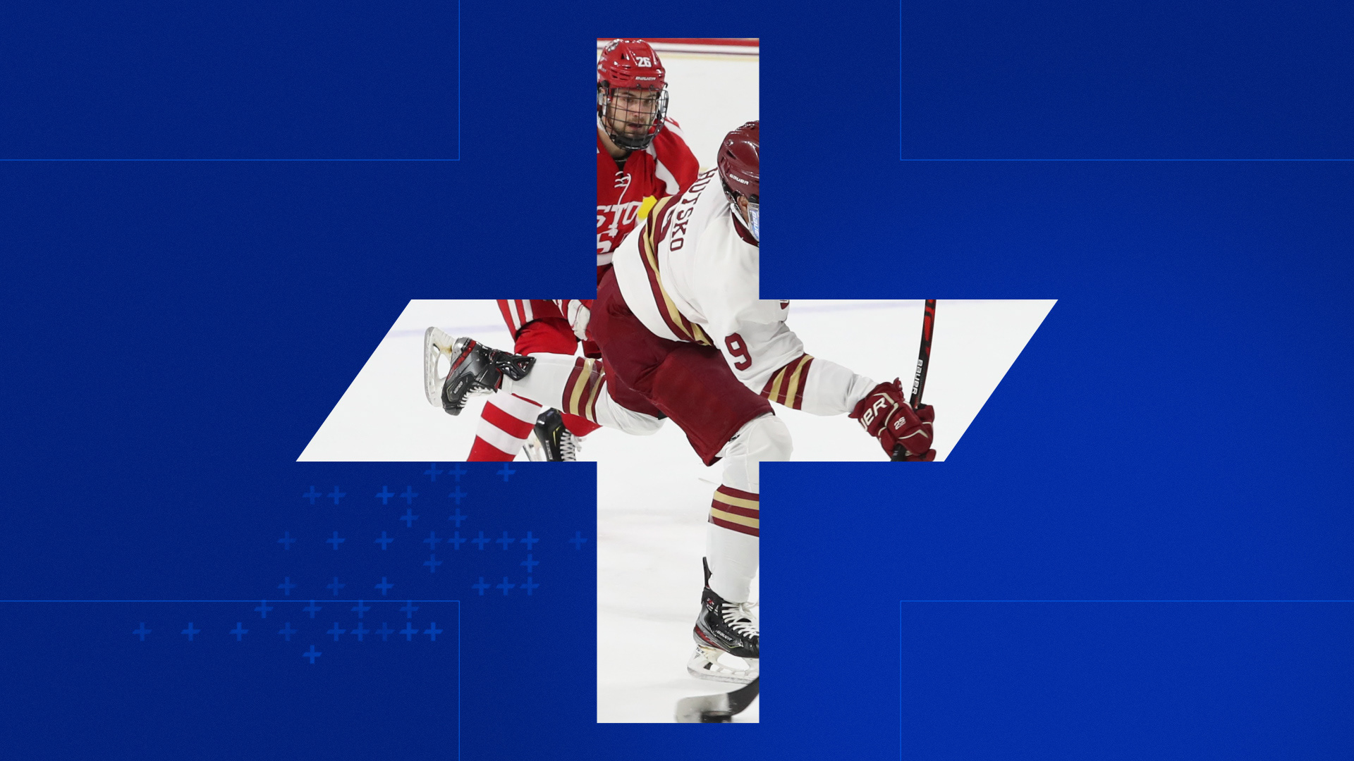
PROMO PACKAGE
—


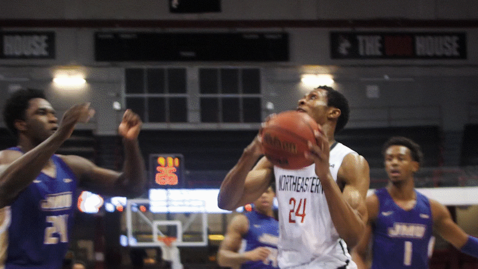
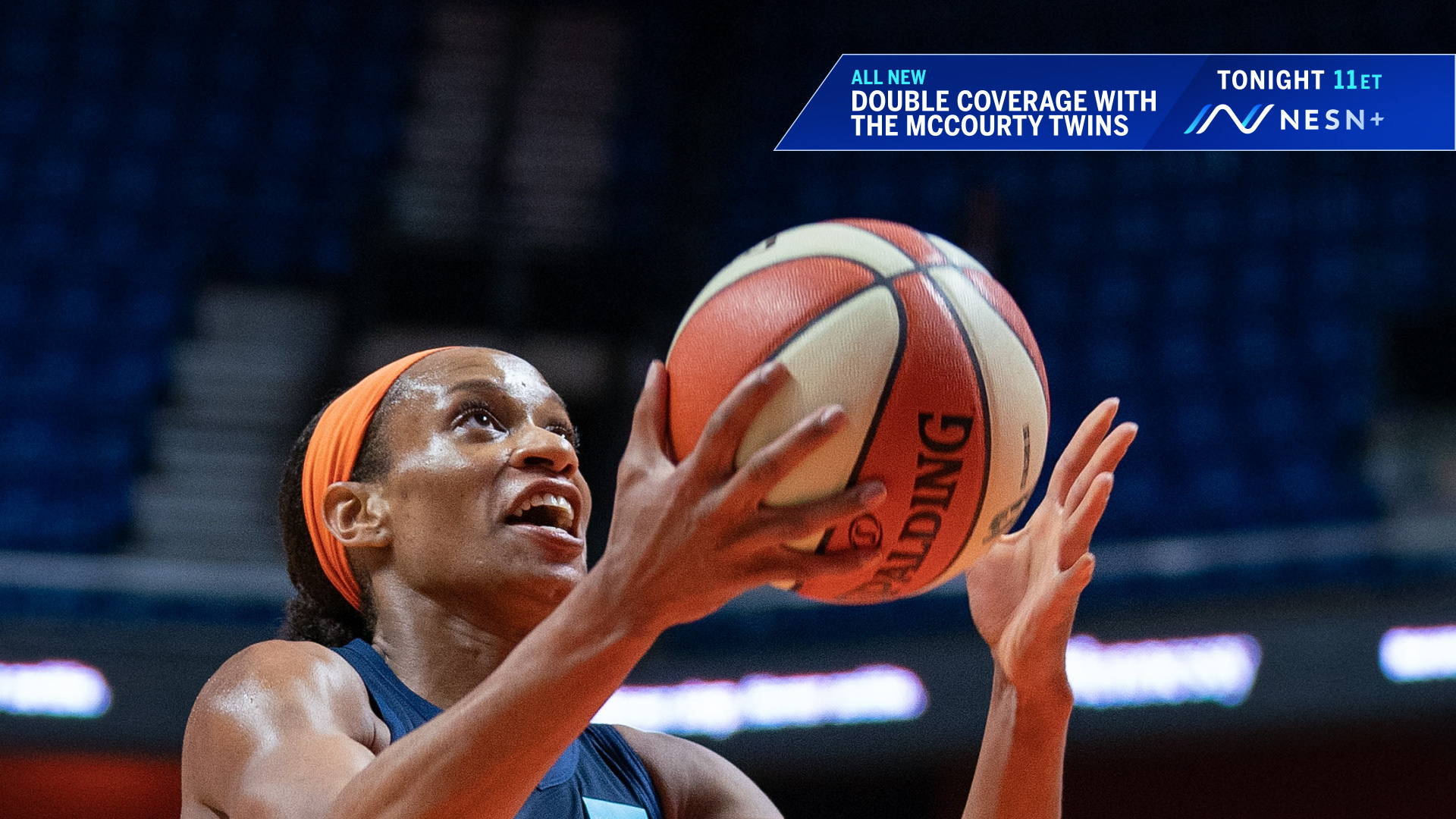
ON-AIR PACKAGE
—

IDENT
—
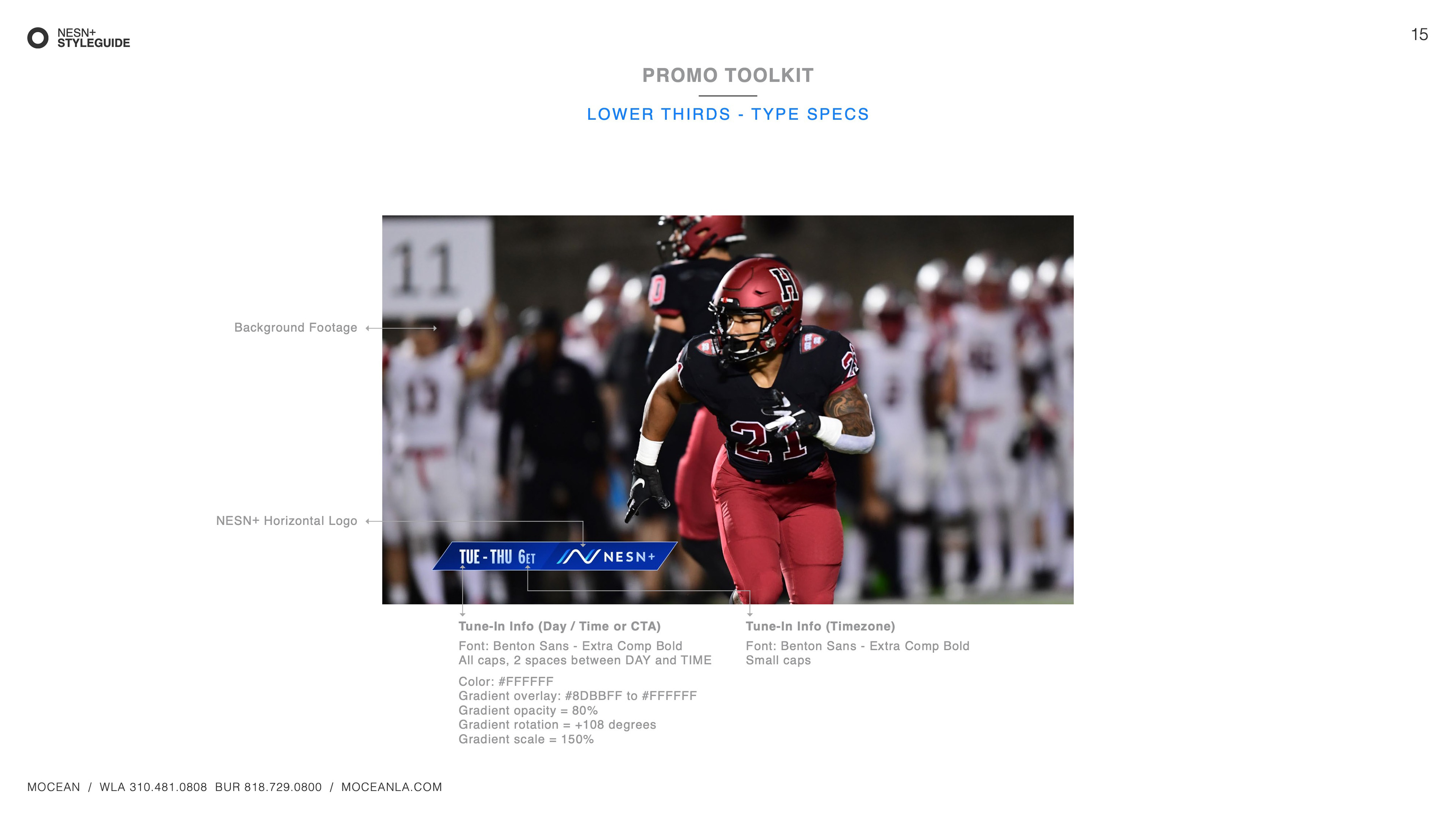
STYLE GUIDE
—